

I recently got a chance to try out Episervers latest acquisition, Idio, right here on codeart.dk. In this post, I'll share my first impressions.
One of the many benefits of being an EMVP is that you sometimes get early (and free) access to some interesting goodies. And after I had seen an initial demo of Idio, it went straight to the top of my wishlist.
I've always had a passion text/content analytics, AI, auto-categorization, auto-summarization, natural language processing and 1:1 personalized recommendations. Both before Episerver, when I worked for the search vendor Mondosoft, and also many times through my years at Episerver, did I implement different prototypes that categorized, analyzed and recommended content. I have been using Nearest-neighbor searches, simple more-like-this searches, RBM's, Google Analytics data mining, NB classifiers, and Singular Vector decomposition in a tons of different experiments to find good approaches to classifying data identifying visitor interests and recommending them content to keep them engaged.
So when I learned about Episerver acquiring Idio, naturally it tricked my interest - and I wasn't disappointed.
Keeping it understandable and simple
One thing I learned from all my experiments over the years is that implementing the algorithms aren't necesarilly all that hard - if you know what you are doing. The science is pretty well documented and researched, and there are many big conferences every year where the latest research is shared.
What is hard, is to make it understandable - at least to editors, and ideally also to visitors. It turns out people are afraid of putting content on their website generated by a magical black box they don't understand and can't control. This is where I think Idio is really on to something.
What they do is this: They evaluate every page on your site and determine which topics is on the page (and how important they are), out of a standard library of 25+ million topic they have defined - my suspicion is that they picked the topics from Wikipedia. They then use natural language processing, supporting multiple different languages to identify the topics for a given piece of content. Meanwhile, they also track visitors on your site and build-up their interest profile based on the topics on the pages they visit.
All of this is done with one simple tracking script - both content analysis and visitor tracking. So it's fairly simple and extremely easy to implement.
David Knipe has made a very well-written post with instructions on how to implement it on your site: https://www.david-tec.com/2019/11/implementing-idio-content-analytics-and-recommendations-on-an-episerver-site/
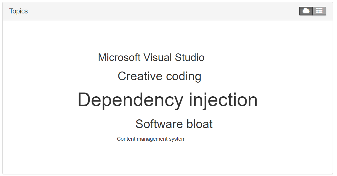
Let's look at an example
If we for example consider this blog post: https://www.codeart.dk/blog/2018/9/error-no-parameterless-constructor-defined-for-this-object/ - which oddly enough is one of my most popular posts (I guess it's a common error). The topics map identified by Idio for it is here:
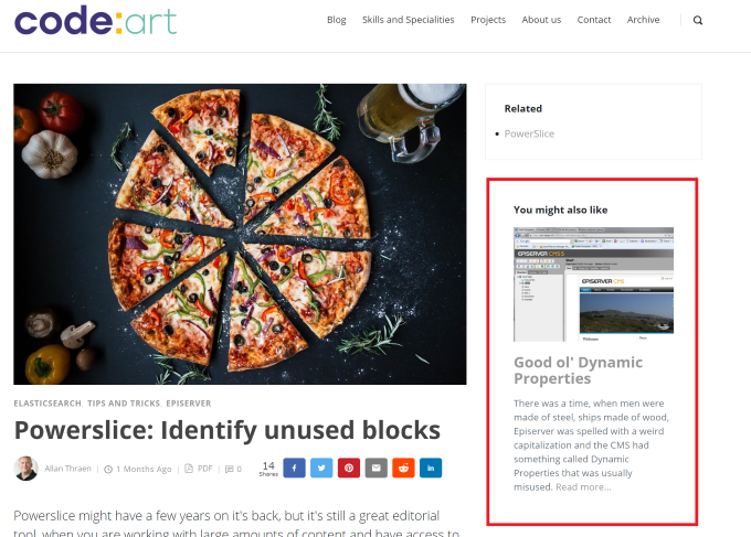
The most visual benefit you get out of this, is of course content recommendations. Basically you can put a widget on your site (or access them through an API) that will show as many recommendations to the current visitor as you want - and you can even easily add filters, if you only want to recommend content in a certain part of your site. While reading this post, you might notice the recommendations on this page - in the current design I put them up top in the right-hand sidebar like this:
But on top of that, you also get some really interesting insights as a site-owner, in the Idio dashboard.
For example, I find this graph very thought provoking:
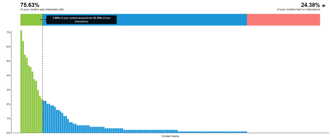
This longtailed graph indicates that roughly 8% of my content is responsible for more than half of all my visitor interactions. It's probably not an uncommon pattern, but the natural conclusion is "I want more of that content".
A way to then figure out which content you should create more of, is to look at the Topic map:
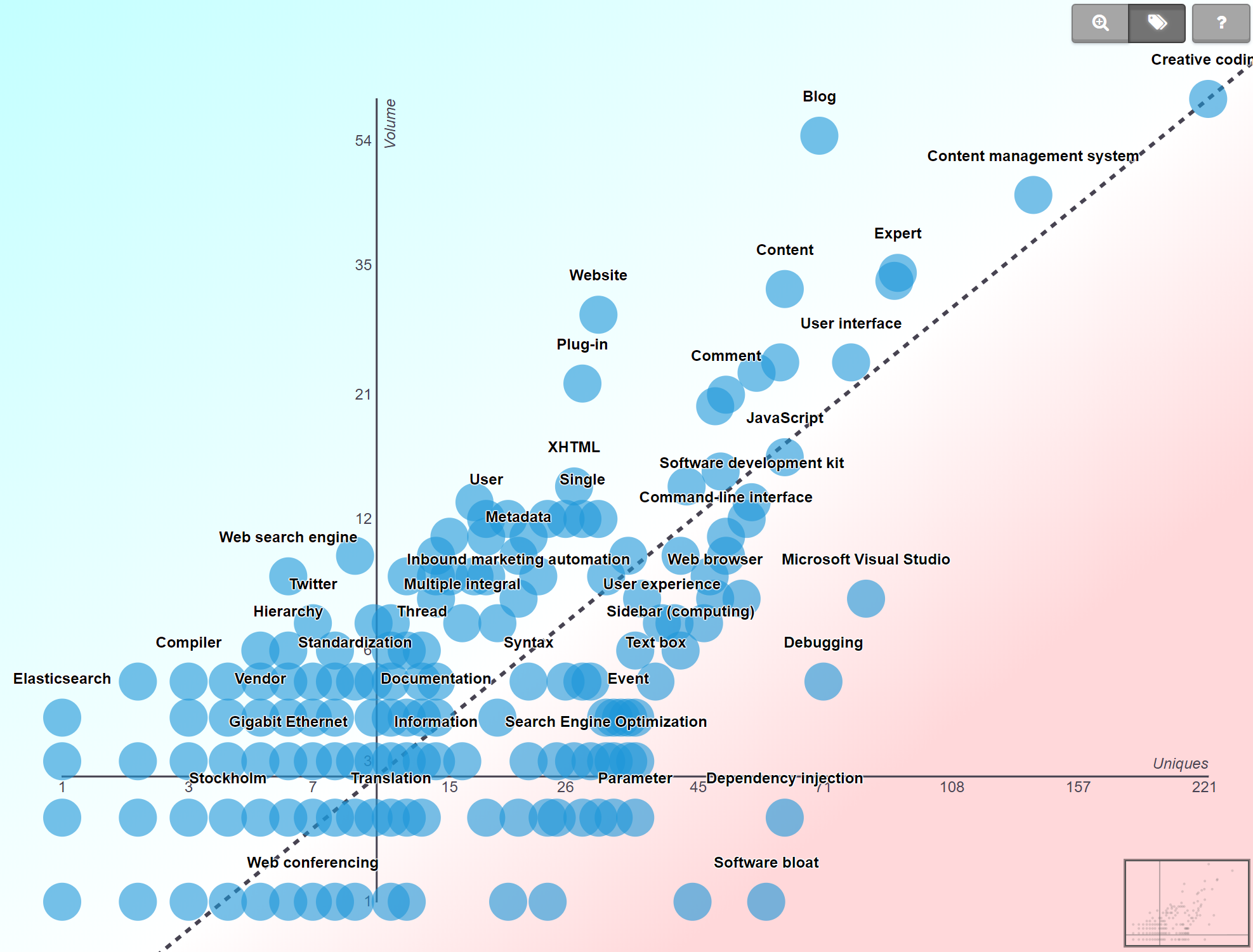
This can seem a bit confusing at first, but essentally all the blue dots are topics. The X axis is unique interactions with it and the Y axis is the volume of content on that topic. So topics in the right bottom are the hot topics, that are popular, but without a lot of content. So this is areas I could consider writing more about. Top left corner are cold items - where I have more content than the visitor interactions would support.
What will the future bring
Obviously, this is still a fairly new acquisition. I'm looking very much forward to see where Episerver will be taken in the future. A UI integration to edit-mode seems like an obvious path to take. It would be pretty straight forward to be able to provide details content analysis directly to the editor editing the content item. And perhaps even let them tweak the topics and add custom topics for a given item.
When displaying recommendations it would also be nice to show more content details, so a tighter integration there would also be nice.
But the area where I have my highest expectations is of course when it comes to integrating to Profile Store. It would be very useful to have topical interests as part of the user profiles, so we potentially could make both segments, visitor groups and email campaigns based on individualized interests.